Thursday, September 27, 2007

Derivative Origins

So, where's the line between the derivative and the original? Does "appropriation" make something derivative any more than working "in the style of" someone?

Ultimately, everything derives from something else right? So, does one require only two elements to create something new?

As a visual study into this phenomena, I have been creating these compositions by manipulating the works of other artists and recombining them (in photoshop, I'm still working on the paintings) . This particular piece was Rothko's Black on Maroon. I changed the proportions, color, and added a self portrait of mine.

The others, below, include Gerhardt Richter, Rothko, Rembrandt, Nerdrum, Jenny Saville, Van Dyke, and some of my paintings as sources.

Does it make them less interesting and engaging if you know the sources, or more so?

On an Aesthetic level I kind of like this one. It's somehow simultaneously both familiar and not.

Sunday, September 23, 2007

A First Tentative Step


So, I'm putting my toe in the water. I've been having a lot of ideas along these lines and I've been thinking about some topics I brought up on The Mnemosyne Journal. What do you think?

Friday, September 21, 2007

Open Critique


This is untitled so far. What do you think it should be called?

Here, I was going for a kind of timeless investigation of the Baroque portrait - an image that might exist anywhere between the 17th to the 21st centuries. I'd love to know what you think. I'm open for critique if you like.

Thursday, September 20, 2007

A Tale of Two Cities

It was the best of times, it was the worst of times. It was everything that they want you to think it was and nothing more.

I have before me two stories. One might even think that they are two entirely different events in entirely different places. But they are both one and the same occurrence, yet with oddly divergent conclusions. They both take place in a small town in Louisiana called Jena.

I'll begin with the story that was told on Fox News, which basically portrays the incident as such (greatly abbreviated, look to the link for the full story):

A black student sits under the "white kid's" shade tree in the high school courtyard. In an obvious reference to strange fruit the white students respond by hanging three nooses in the tree. It was decided by the school that it was merely a prank, and so they received in-school suspension.
Six black students beat a white student. He was beaten unconscious but was not permanently injured. The black students were charged with second degree assault and the white students were charged with nothing. Thousands of people have gone to Jena to protest the trial of one of the students, including Martin Luther King III, and Al Sharpton. They call this the civil rights issue of the 21st century.

"It is not and never has been about race," he said. "It is about finding justice for an innocent victim and holding people accountable for their actions."
-District Attorney Reed Walters
If you're like me, (and I'm going to be painfully honest here), you're going to come to certain conclusions based on the information above. Here's my bias. This is going to sound ridiculous - but I'm not racist. Though, I am a white guy raised in white culture. I feel uncomfortable in black culture. I often think that those who populate the stereotypical black or "rap" culture are loud, obnoxious, say and do stupid things, expect special treatment because of their race, and are overly aggressive. This of course makes me defensive and much more likely to jump to certain conclusions. This also gives me a tendency to be less patient and be overly aggressive and judgmental towards them. But, of course, I could say the same thing about quite a few rednecks I knew in the south, as well as some of the kids I've seen here in Brooklyn (of various races). But I think that admitting my prejudices (which we all have in some capacity) helps me to work through them. See, I try not to let my actions be influenced by my prejudices because I see them for what they are.

However, given my biases which I have painfully pointed out to you, I am extremely accepting compared to many people I know including family members that I dearly love. Someone not very different from myself might think that the white boys got off too easily, but they at least didn't brutally beat anyone. Someone not very different from myself might conclude from the story on Fox that this is just another mole hill made into a mountain by a culture that just can't let go of what someone else's great-grandparents (not mine) did to their great-grandparents, which doesn't effect us much anymore. Someone like me would say: Get an education, get a job, don't attack people - this will solve your problems. (Yes, berate me, I'm insensitive!)

But there's more! On July 30th, the story was aired on NPR which I like to listen to while I paint. Like any other day that I'm working in my studio, I was listening. I suggest you read the entire story in the link above.

Of course what I heard outraged me, but what outraged me even more was realizing the extent to which Fox News omitted extremely crucial information. Even a purely white-bread like me realizes injustice when I see it. Here's the kicker:

"With one stroke of my pen, I can make your life disappear."
- District Attorney Reed Walters
This, he said while allegedly looking at the black students who were in a peaceful, silent sit-in under the shade tree. (I have skipped some parts in the interest of brevity, but please do read the original article on NPR)

The next night, 16-year-old Robert Bailey and a few black friends tried to enter a party attended mostly by whites. When Bailey got inside, he was attacked and beaten. The next day, tensions escalated at a local convenience store. Bailey exchanged words with a white student who had been at the party. The white boy ran back to his truck and pulled out a pistol grip shotgun. Bailey ran after him and wrestled him for the gun.

After some scuffling, Bailey and his friends took the gun away and brought it home. Bailey was eventually charged with theft of a firearm, second-degree robbery and disturbing the peace. The white student who pulled the weapon was not charged at all.

The following Monday, Dec.4, a white student named Justin Barker was loudly bragging to friends in the school hallway that Robert Bailey had been whipped by a white man on Friday night. When Barker walked into the courtyard, he was attacked by a group of black students. The first punch knocked Barker out and he was kicked several times in the head. But the injuries turned out to be superficial. Barker was examined by doctors and released; he went out to a social function later that evening.

Six black students were arrested and charged with aggravated assault. But District Attorney Reed Walters increased the charges to attempted second-degree murder. That provoked a storm of black outrage.

I don't know about you, but if someone pulls a gun on me and I take it away, I don't think I could show such reserve and just walk away. I would probably beat him senseless. Pulling a gun is an overtly life threatening gesture. In such a case, one is protected by the law, in that you may kill in self defense. I'm not saying I would kill the guy, but he certainly wouldn't forget what happened and I would feel entirely just in my actions.

In short, there are two Jenas here: one in which a minor racist action lead to an over-reaction, and one in which a great disregard for justice spreads like a cancer all the way to the top officials of the town.

I typically reserve this forum for art related events. But this is something that I simply cannot overlook. Further, I do not wish to overshadow the injustice of this event, but we need to get to the root of why this is an issue in the first place. People are influenced greatly by the media, and if the media condones such actions, so will many people.

I encountered almost the same exact story on all the network news stations. I have known that the media has been misleading, mis-characterizing, and acting as political propagandists for years. But the degree to which this has been allowed to go is absurd! For Democracy to function, the people must be informed - if not in an unbiased way, then at least with all the basic information. This is not just an issue about racial injustice (which is terrible and obviously the case), this is about the media lying to us about the food we eat (growth hormones, GMO's, trans-fats, pesticides, antibiotics), the medicines we buy, and the wars that our leaders wage. This is about them robbing us of our families, our money, our lives through obfuscation- and clearly because the media is owned by the same corporations that stuff the pockets of government officials. I for one will no longer stand for it. If there ever was a time for a revolution of truth, the time is now!


The Truth Shall Set You Free.

Tuesday, September 18, 2007

Oil Painting Techniques: Glazing

So, here I'll give you way too much information on glazing (or indirect painting). But you can pick out what you need and forget the rest. It'll be right here if you ever change your mind.

Here's the first rule (yes, in art rules are for breaking, but you have to understand the rule before you can break it most effectively)


Fat Over Lean

All mediums are fat, all opaque pigments without medium are lean. You want to paint opaquely first, with little or no medium. In subsequent layers you can move to using more medium because the oil will soak through to the first layer. Also, you don't want the under layer to dry slower than top layer as this will result in buckling and cracking.

The basic elements of glazing are pigment and medium. We'll start with the medium first.
Mediums can be as individual as your brush strokes, so there's no "true" formula. However, there are a few rules of thumb that you want to keep in mind.


  • Never use Damar Varnish in your medium. If your painting is ever restored, they will remove the final varnish, and in doing so all of the varnish in your piece will break down. Meaning each layer will separate and your painting will disintegrate.
  • Too much solvent in your medium will cause your pigment to break down, destroying your color and texture. One should never use more than 50% solvent.
  • Certain oils tend to yellow more over time, so you definitely don't want to use vegetable oil. Stick with refined oils: linseed, poppy seed, walnut, spike oil.
Here are a few formulas:
(I recommend Gamsol instead of turp as it is safer and has no odor)

Easy Formula: 1/2 Refined Linseed oil, 1/2 Turpentine (vary quantities according to viscosity that you want) This is pretty quick drying and good for sketching and painting fast. However, it's not great for layers of delicate color - too much solvent. 2/3 oil, 1/3 solvent is much better for that purpose.

Vincent Desiderio's formula: 1/3 Venetian Turpentine, 1/3 Sun-thickened Linseed Oil, 1/3 turpentine

Adrian Gottlieb (which he says was taught to him by "Scott" at Charles Cecil's Studio): 1/2 Sun-thickened walnut oil, 1/4 Canadian Balsam, 1/4 Turpentine


There are three basic types of glazes:

1. Traditional glaze: a transparent pigment diluted with medium, color will become warmer.
2. Velatura: a glaze with a color which is lighter in value than the under layer and is semi-transparent. More simply put: it has white in it. This will cool off the color

3. Scumbling: an opaque kind of glazing produced by loosely dry brushing one color over another so that the under color shows through. There is no set rule here for temperature change as this depends upon the pigments, but generally if the value of the pigment is lighter than the under layer it have a cooling effect, darker will have a warming effect. This is great for optical blending, where you do not actually blend colors to produce a third color, but they look blended from a distance.

Transparent Glaze Palette

It's important when glazing to know the transparency or opacity of the pigment, as this will affect your color temperature and how you work with it. Different pigments have different abilities. Due to the strength and intensity of these colors, painters only need to mix a small amount of color with a suitable painting medium to produce a rich and vibrant glaze.

Indian Yellow — warm yellow makes painting look lit by sunlight

Transparent Orange — warm orange

Perylene Red — cool red with yellow undertone

Quinacridone Red — cool red replacement for Alizarin and makes high key tints

Quinacridone Magenta — cooler high key red

Quinacridone Violet — clean, warm violet

Dioxazine Purple — cold purple that can be used for a black

Manganese Blue Hue — cool (leans toward green) transparent blue

Phthalo Blue — 20th century replacement for Prussian Blue (also slightly greenish)

Phthalo Green — cold, dark green with great transparency and tinting strength

Phthalo Emerald — warmer, more natural looking Phthalo Green

In addition to Transparent Glaze Palette, these colors provide the abstact painter with a unique set of visual possibilities:

Mono Orange — clean, bright semi-transparent color, masstone of Cadmium Orange

Mars Black — dense, strong mark making black

Black Spinel — only black with neutral masstone and tint, dries matte

Hansa Yellow Deep — golden yellow, semi-transparent


The beauty of oil paint as apposed to acrylic is it's flexibility. There are five basic paint consistencies that you can use that will dramatically change your results. The more medium you add to your pigment, the more transparent it will become.

Impasto - thick textured paint application (Lucien Freud)
opaque - flat, even paint
semi-opaque - slightly transparent
semi-transparent
transparent

These relate to the visual effect you want to produce.
Most of the old masters stayed in the semi-transparent, semi-opaque range with areas of Impasto and limited glazes.
Alex Katz paints completely opaque - which reinforces the flatness of his paintings.

*For an old master technique, here's a good rule of thumb: Shadows lean towards transparency, light mass is more opaque. This helps to reinforce the way light functions.

Here's a great exercise that Stephen LaRose recommended:


The most successful lesson that I had in glazing went this way:

I handed out, as homework, swatches that the students had to match. I didn't tell them that the swatches had an order.

There was a uniform color swatch, much like a paint chip (here the students simply honed their mixing skills)

There was a swatch that was the first color scumbled with medium to show the white of the canvas peaking through in an organic and random way. This was a technique lesson.

There was a third swatch that had a warm glaze over a version of the second swatch.

Then a fourth swatch with a cool glaze over the third swatch.

Four levels of optical confusion is all that most rookies can handle.
And another great exercise from me:

Cover your entire canvas with a wash of any transparent pigment, Castle Earth, Transparent Red Oxide, Indian Yellow (I prefer more neutral colors, but chromatics like Pthalo Blue or Dioxazine Red work too). Paint into the "sauce" with only white to model the values. This is also great for beginners because it helps them to see how their alla prima technique relates to glazing and how a wet glaze will change their color.


Or a similar technique also from me:

Make a charcoal drawing. Dilute yellow shellac with denatured alcohol. Spread this mixture over the drawing with a large squeegie and let dry (should take around 30 min.) You can then cover this with a glaze and paint with oils into the glaze on top of the drawing (which is completely preserved) - this produces a very interesting effect.

Light Temperature and Form


You can find each of these above.

Highlight: cooler than light mass
Light Mass: warm
Turning: cooler
Shadow: Warmer than turning, but cooler than light mass
Core Shadow: cooler
Reflected Light: Always warmer than core shadow, but depends upon the color reflected.

*note - the color and temperature of the flesh is greatly dependent upon the color of the background. Also chromatic intensity in the background influences chromatic intensity in the flesh.

Vincent Desiderio likes to use a single unifying glaze over his whole painting. He feels that this helps to set a mood or atmosphere. Many artists use glazes for local color. Some leave them as is, and some modify them by painting back in wet into wet.

If you have any questions, feel free to ask.

Oil Painting Techniques: The Grisailles

It's helpful with students who are new to painting to isolate different elements so they can learn the technique and not focus on juggling. The strengths of this are great for learning, the artist can isolate drawing and value problems first, let it dry, and then tackle color.

So, with this in mind I would like to share with you the 
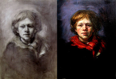
grisailles wipe out technique (image on the left). What you see of the light is the ground showing through. I reserved the use of white for highlights. Instead of black and Trans red oxide listed below, I used only Chromatic Black (Gamblin).

Under-painting methods: The Grisailles

Materials:

Oil paints: Burnt Sienna or Transparent Red Oxide, Cold Black or Ivory Black, White (I use Gamblin flake white replacement, but Permalba white is a good one too).

Medium: Refined linseed oil, solvent (I use Gamsol because it is the least harmful to your lungs).

Brushes: A 1” house painting brush for blending or a large fan brush, One filbert about as thick as your thumb, One smaller filbert, and the smallest should be a round maybe a # 4.

(The important thing is that your brushes are not too soft or too hard. Bristles tend to be inflexible, and sable brushes are too soft so that you can’t control them. I prefer mongoose hair, which is in between leaning toward bristle, but these can be expensive. One can find a nice synthetic that should do. To test them, press the tip down and to the side with your finger, the hairs should spring back into position when released.)

Surface: Panel or canvas, around 24”x36” is a good size. Make sure it is prepared with a dry ground (will be explained later).

Easel: This is a must, because you cannot observe accurately if you have to keep looking down at a table. You can find small table-top easels for fairly cheap. The important thing is that your surface is vertical.

Palette: Just a hard surface to mix paint on, preferably white or grey (these colors give you the ability to clearly see your paint color and value without distraction. One can make a great one with plexi-glass on top of half inch foam core cut the same size and duct taped around the edges. This is easy to clean up and can be wiped down with solvent.

Containers: You will need something to hold your solvent (old olive jars with lids work great) and smaller containers for your medium.

You will also need some paper towels, a kind that is somewhat soft. I prefer the blue rolls you find in automotive stores because they don't release fibers.

The Ground:

Mix a grayish neutral with your burnt sienna, black and white. (I prefer to lean more towards blue, like faded blue-jeans) It should be a little lighter than a middle gray-see grisailles above. Cover your surface with an opaque layer.

If you use oils for the ground, make sure you give them ample time to dry (36 hours should do it) before you paint on it. Acrylics are great for grounds because they dry within a few hours.

Preparation:

Set up the subject with a strong light source. This makes it easier to see the value relationships and can be quite beautiful as well. It’s good to paint at night, so you don’t have a lot of light from windows coming in. If you work during the day, try to block out light with black curtains or something.

Make sure you have room to set up your easel a few feet away.

If you are right handed you should set up with your still life to the left, and your easel on your right at an arm’s length, and the opposite if you’re left handed.

It is very important that your easel and surface are nearly vertical and set up in this way, because it gives you the ability to quickly glance back and forth (with your eyes) from your objects to your painting without moving your head. When you move your head your perspective of the objects changes! And you will have distortion in your painting.

The Method:

Mix 50% trans red oxide and 50% black on your palette.

Mix 50% linseed oil and 50% solvent in your small container.

Add some of these two mixtures together in equal portions, this was called “the sauce” in the French academies (save some of your oil paint without medium for later).

Cover your entire surface with a thin, semi-transparent layer of “the sauce” and lightly blend with a rag until it’s fairly uniform.

Looking at your subject, make a light sketch of your composition in simple contour lines using the oil paint mixture with no medium. You should be able to get long smooth brush strokes painting into the medium on the surface. If not, then you need more solvent in your mixture. You can compensate by adding a little medium and drawing with that. Remember;

Rules for drawing:

Work from light to dark. Always draw out the entire composition lightly first. If you make a heavy mark, it is harder to change than if you make a light mark. You can always go back and redefine and darken lines later.

Work from general to specific. Start with large ideas and large relationships first, the detail comes much later. Example: light area and shadow area. Squint your eyes.

Work from large shapes to small shapes. Accuracy is first in how large shapes relate to other large shapes

Work the total surface. You cannot move on until you know how each form relates to each other form in the entire composition.

Once you have your basic relationships between large shapes set up and your drawing is where you want it, Wipe out your major light shapes with your paper towel or rag.

Further build up the light mass with only your large filbert. (Use only the large brush in the beginning and for as long as you can, then your medium brush, then your small brush. Small brushes are for detail and detail comes last.)

(If you’re not sure where the change is between light and shadow, hold your brush over the questioned area of the object. If the shadow that it casts is visible, that is light mass. Where it disappears is shadow.)

You want your major light masses blocked in before you move on to other values. One way to get a good idea of the major light/shadow forms is to squint your eyes. This simplification is essential in starting the painting. As you develop your value remember the elements of

Chiaroscuro, or light and shadow

Highlight: the lightest light, or reflection on object.

Light mass: the major area of light.

Turning: where the light mass meets shadow.

Shadow: general area of shadow

Core of the shadow: the darkest portion of the shadow. It may be subtle and hard to see, but every shadow has one.

Cast shadow: the shadow made by the object on another surface, such as the table it is on or another object beside it.

Reflected light: light bounces off of another object that is light and may create a lighter area within your shadow. Some people like to leave this out (Caravaggio) but if you choose to have reflected light, remember that it is still shadow and cannot be as bright as your light mass, because it shouldn’t compete with your light.


Edges: If you look at a piece of paper, the edge is always sharp and hard. But if you look at a round object, like a shoulder or face, the edge is soft and fuzzy. You want to exaggerate this in your painting to make it look as if it turns in space.

Identify the elements of light/shadow… also notice which edges are hard, and which are soft.

Cast shadows are never hard edged. They become even fuzzier as they move away from the object that makes them.

Learn, experiment, and have fun!

But come back tomorrow, I'll discuss glazing techniques.

Sleep

Vincent Desiderio, Sleep 8' x 24'

Monday, September 17, 2007

Kitsch Questionnaire


Following the train of thought from the last post, I'd like to expand on the discussion on Kitsch.

Here's an interesting little yes/no questionnaire I came across in Odd Nerdrum's book On Kitsch.


1. Do you prefer truth to talent and sensuality?
2. Is the ironic mask better than the serious, trusting face?
3. Do you have contempt for those who try to rob the old masters of their technique?
4. Are the great archetypes, such as; two lovers by the sea, mother and child etc. outdated cliches?
5. Do you long for a dialogue with the present rather than an eternal expression?
6. Are you more preoccupied with exposing man rather than giving him dignity?
7. Are you more attracted by living in an artistic process rather than creating a masterpiece?
8. Do you like the decorative expression above the sentimental expression?
9. Are progressive ideals more important than natural studies?
10. Do you want your work to be accessible to only a select elite and not for all?
11. Do you think that a classical-figurative painter has to live as an inferior <>?
12. Do you work towards the development of rules of originality and not for your own ego?
13. Is the term <> old fashion and inapplicable?
14. Do you despise those who seek their own desires even in a work which is not understandable?
15. Do you view the knowledge of craftsmanship as being a hindrance to free expression?
16. Is debate in the public world more important than the intimate sphere?
17. Are there motives you are afraid of portraying because you've seen them done so many times before?
18. Are you more interested in belonging to a group which is fashionable, rather than being in contact with an isolated individual with ability?
19. Do you maintain that humankind constantly improves itself and that their hearts are never the same?
20. Have technical aids, such as the photograph, greater magic than the work of the hand?
21. Do you think that the relationships between the hand and eye of a living person is a defunct expression, and that the future will only deal with visuality untouched by human hands?
22. Do you believe that your life and your work are two different things?
23. Is modernism [post-modernism] the final level in the development of our history?
24. Are you disgusted when you hear that modern artists hate talent?

Rate yourself:

If you answered "no" in response to all of the above, then you are - according to the following art critics: Broch, Calinescu, Greenberg, Kulka, Kundera and Ortega y Gasset - a real kitsch person.

If you answered "no" in response to question number 10, you are well on your way.

If you answer "no" in response to five questions, or fewer, you are still an artist.


Have you read the book? Nerdrum seems to address only Modernism - do you think he's specifically ignoring Post-Modernism, if so, why? Do you think it's just a [successful] publicity stunt, or do you think he brings up some good points? Is the redefinition of Kitsch important or relevant?

Saturday, September 15, 2007

Beautiful Lies

Victory, Pax ---------- The Wounded

As I am reading Kiss of the Spider Woman by Manuel Puig, I came across a description of a Nazi propaganda film entitled Her Real Glory. What interested me was the way Molina (the character narrating the film in the book) describes the beauty of the film. Though Valentin (the communist revolutionary) finds it necessary to point out the lies within the film, Molina asserts that he appreciates it even so - regardless of whether he believes the message or not.

This brought to my mind a fairly well known quote:

"Art is a lie that [reveals] the truth." - Picasso

And so I began thinking (once again) about the relationships between art, beauty, and truth. What some would call Kitsch, others may label sincere. Certainly, Nazi propaganda was rightly disavowed by Greenberg, though in attacking kitsch, he shot the messenger for the message. But is it truly necessary for something to be true to be art? Can one, in this age, appreciate a work of art for its own merits (as Molina does) and not consider the political implications even if one disagrees with them.

"Beauty is truth, and truth beauty." - John Keats

Or is it a matter of the specificity of truth? What I mean is - the Nazi film did not present the truth in terms of its main content, but perhaps it did convey some truth: a truth about human nature. Yes, it served to strengthen the virility of the propaganda, but it also created a greater value in the work beyond the implicit meaning.

Friday, September 14, 2007

Saturn Reflected


Goya and Rubens, Saturn Devouring His Children

After Jacques de Beaufort's interesting post, I began thinking of the nature of visual relationships in dichotomous analysis. I would love to know your thoughts on this comparison above.

Thursday, September 13, 2007

False Dichotomies

for my first ArtBabel post I thought I'd dust off an old number from the archives...enjoy:

Rattling around the artblogs recently I've noticed a cloud of thought hovering over the notion of "value" in painting. "How do we determine value in art?"..a question asked (and answered) by Jed Perl, among others in direct response to the vast influx of hedge-fund money that seems to be turning the notion of artworld correctness and propriety upside down. To me it's a curious problem because it represents an alchemical conversion of abstract ideas and concepts into a numerical equivalent in currency. This is ostensibly a method of gauging the collective belief and confidence in any given set of "values" that may be winning out against other values at any particular moment in the popular imagination. The problem is not in the notion that certain ideas seem to be more popular than others within the context of a moment in time (a constantly changing and unreliable measurement), but the tendency for "value" judgements themselves to assume either/or categories, bifurcations that represent false dichotomies .

Here are a few false dilemna's you may be familiar with hidden in rhetorical questions and statements:

Are you with us, or with the forces of racism and oppression?
Are you a Republican or are you a Democrat?
America - love it or leave it.
Nobody wins unless everybody wins.

In art history, the contrived dualisms that best represent this type of Manichean logic have seemed most salient to me in the relationship between two artists such as Fragonard and Greuze. Fragonard came to be eponymous with the Rococo and the artificial tastes of the Aristocratic culture he catered to. On the other hand, inspired by the writing of Romantic thinker Jean-Jacques Rousseau and his insistence on "natural" virtues as an antidote to the corrupt "ancien regime" that hovered like a bloated corpse above French society of the 18th century, Greuze embraced the simplicity and sincerity of common villagers and the "realness" of their everyday lives. We are aware of course that Greuze is the "winning" side in this contest, with the French Revolution virtually annihilating through exile or beheading the patrons that supported Fragonard, who died penniless and forgotten in 1806.

Looking at Greuze in 2007, it's hard for me to see "naturalness" and sincerity. Instead, I see a pantomime of these virtues that borders on histrionic. The work only communicates simplicity in the way that a caricature might. It is ham-handed, farcical, melodramatic, and calculated. It is only by placing the work in a false dichotomy besides it's conceptual enemy do these characteristics become even a little bit real.

Dichotomies are common in Western thought, a condition that C.P Snow has described as the "culture of argument". In such a climate, dialogue is characterized by a warlike atmosphere in which the winning side has truth (like a trophy). In such a dialogue, the middle alternatives are virtually ignored. Obviously for art to have numerical value in currency it must pass through this odd mechanism of valuation. And maybe this is why the pugnacious disgust at what Jed Perl has described as "Laissez- Faire" aesthetics might be a little over blown. I'm not advocating a sort of glib nonchalance that represents a superficial and shallow commitment to the world of ideas…but I have to say that today's culture is clearly based on a model of cultural customization that seems to represent a step away from the epic righteousness of dialectical thought. Although it's clear that the impetus for this de-valuation of "value" has more to do with fashion, constantly shifting tastes, i.e. trendiness, and the "democracy of access" granted by new money, the net affect is a logical and positive step away from art as yet an other emblem of ideology (..."-ism").

It's not insignificant to note that Greuze also died broke and penniless a year after Fragonard..a victim of his own extravagances and a deep inability to manage his own success. In my mind the notion of "victory" and "revolution" are absurd concepts that by necessity create pathological cults of belief. In this way winning and losing are real concepts, but ironically can never be consummated. Today's winner is tomorrow's loser, and the individual is caught in a never ending whirlpool of torment that to me seems the most tragic reality that an artist can know. People that talk about moving art into what's "next" usually do so because they believe their contribution represents the inevitable destiny of the conversation of art history, and see their own art embedded within this sequential narrative. This dissatisfaction can generally be thought of as a subjective affect that I feel is an inevitable byproduct of lamentably mistaking the social-economic matrix of the "artworld" for the broader concept of "art" as a concrete cultural manifestation of applied philosophies-which should ideally transcend notions of game theory and market value. Implicit in this new version of historicity is the diffraction of all Grand Narrative outwards into an multi-dimensional Field of possibility and connectivity. In this way there is no such things as "winning" and "losing", but rather all that exists are vectors of relateability that are separate and distinct from a bounded and linear time-based model that we have come to call "Art History". The emergence of recognizeability or "celebrity" among an enormous pool of abundantly talented artists is merely an epiphenomena of social conditions/networks in a media driven culture along a given axis of causality and should not be regarded as an inevitable destiny that has become manifest.


"Herein, perhaps, lies the secret: to bring into existence and not to judge. If it is so disgusting to judge, it is not because everything is of equal value, but on the contrary because what has value can be made or distinguished only by defying judgment. What expert judgment, in art, could ever bear on the work to come?"
-Deleuze

Wednesday, September 12, 2007

Delacroix: Poetry and Painting

I can distinguish poets and prose writers among painters. The rhyme, the restraints imposed by the metre, the form that is indispensable to poetry and gives it so much vigour are like the inner symmetry in a picture- the studied, yet inspired rhythm that governs the junction or separation of lines and spaces, the echoing notes of colour, etc. It would be easy to demonstrate this thesis, were it not that more active faculties and keener sensibilities are needed to distinguish errors, discords and misstatements among lines of colours, than to discover that a rhyme is faulty, or a hemistich clumsily or wrongly put together. But the beauty of poetry does not depend on exact obedience to laws, whose neglect is obvious to the most ignorant. It lies in a thousand harmonies and subtle arrangements of words and sounds which give to poetry its power and appeal directly to the imagination, just as in painting, the imagination is affected by a happy selection of forms and a proper understanding of their relationship one to another. David's picture Thermopylae (above) is, I consider, an essay in masculine and vigorous prose. And Poussin hardly ever uses other means to rouse our ideas than the more or less expressive gestures of his figures. His landscapes seem to be more carefully thought out, but like those other painters whom I call the prose writers in contrast to the poets, he seems more often than not to assemble the tones and arrange the lines of his composition at random. The poetic or expressive idea never strikes one at first glance.
- The Journal of Delacroix, 19 September 1847

Rebel, Rebel


"Artists who seek perfection in everything achieve it in nothing."
-The Journal of Eugene Delacroix 14 March 1858
This calls into question one of the key rules we learned at the New York Academy (the same tradition which originated in the French Academy)- treat every inch of the canvas as if it were the most important part.

But then, how does one create a hierarchy? If everything is painted with the same veracity, how do you communicate your ideas with the viewer? How do you create a dynamic application of paint?

It's interesting how people today see Delacroix as the epitome of tradition. Like many of the Romantics, he was truly a passionate rebel.

Monday, September 10, 2007

Effroyable: A Fearful and Infinite Sphere

Following the philosophical trail from Hermetic philosophy to physics.
"God is an intelligible sphere, whose center is everywhere and whose circumference is nowhere." - Trismegistus (3rd C.)

"The world is the infinite effect of an infinite cause, for it is within us even more than we are within ourselves." - Giordano Bruno (14th C.)
"The universe is an infinite sphere, whose center is everywhere and whose circumference is nowhere." - Pascal (15th C.)
It's interesting to note that in the original manuscript Pascal first wrote the word effroyable: "a fearful sphere" in place of infinite. From which I surmise that he's following this logic :

"[This idea leads man] to feel lost in space and time. In time, because if the future and the past are infinite, there can not really be a when. In space, because if every being is equidistant from the infinite and the infinitesimal center, neither can there be a where. So, no man exists at a certain time, at a certain place, and no one knows the size of his own countenance." - Jorge Luis Borges

Sunday, September 9, 2007

Painting in the Third Level of Hell

I recently received a commission for this portrait.
"Hey", I thought "I like painting portraits". So I accepted the commission.

And then it began. The third party art studio through whom I received the commission suggested that they would print a badly photo-shopped picture onto the canvas to insure that I painted a likeness.

I was, of course, quite insulted. I didn't pay $40,000 for a masters from the Graduate School of Figurative Art (New York Academy) , and spend 20 years painting, so that someone could tell me that I didn't know how to paint a likeness. So, biting my tongue because I needed the money, I told them that it wasn't necessary. She insisted

I'm a patient man, so I again bit my tongue and suggested a compromise. "Print it in black and white or sepia so that it doesn't throw off my color development." She agreed. So, we wait a week for them to print it (during which time I could have painted the damn thing.)

The day I pick up the canvas she is not there, so I head home to find (to my horror) that it was printed in color! Not only did the image have drastically distorted proportions, but the color resembled the yellow glare of a Las Vegas street light.

And then there was the goofy smile.

I try not to be the kind of person who takes myself too seriously, but this just crossed the line. I mean I do have self-respect. So, I called the offending party up and promptly refused the commission. However, a friend of mine manages the studio (not the one causing the problems) and she begged me to do the portrait as the deadline was in four days and she didn't have time to find someone else.

FOUR DAYS????

Look, I'm typically a pretty thorough person. I asked the standard questions at the beginning and got vague responses - that should have been enough warning. But I really needed the money. My friend negotiated more money for me to finish the painting, and not wanting to put her in a bind, I agreed to do it. Certainly, the money helped too.

I roughly sketched out the composition and decided to give her a dignified expression and get rid of that cheesy smile. Upon e-mailing the image, I received this response:
As she is currently painted she looks too old and we would like you to refer back to the original print exactly as it was for her face and her smile, as we all found that to be pleasing.
How could she look old or young? It's a sketch!
No matter how I tried, I could not find a middle ground between what I could deal with and what she wanted (which changed daily by the way).

So, I bit my tongue so hard it bled.

And I painted the image above. The first day was 10 hours of pure, unadulterated, torture. Not only did I hate what I was painting, I couldn't paint properly because I didn't like it - so everything I knew went out the window and I struggled the whole time.

The second day was 12 hours of lamentable hell, and I still had a mental block. I finally came to what we have above, and I'm totally exhausted. I feel as if I've sold myself on the corner and been violated for 63 hours (shudder).

So, here's my advice:
Always make your price, time line, and working conditions perfectly clear at the beginning. Make sure there is a legal contract.
If they are not forthcoming with information, they are not someone you should be doing business with.

Update: The offending third party has now refused to pay what we agreed upon, and now asserts that she will pay me the equivalent of $7 an hour (big, surprise). I made more that when I worked at Wal-Mart in high School. She refuses to negotiate. So, I now have no qualms in revealing their identity in the hopes of warning others.

The company is Novo Arts, and the neurotic, condescending, micro-managing owner and arbiter of bad taste -who couldn't paint her way out of a paper bag (I've seen her paint) - is Marlaina Deppe. Further, her knowledge of art history doesn't extend much beyond Impressionism. Not only is she undercutting the business for real artists, she is exploiting us and destroying the quality of the work. I would strongly advise anyone who comes into contact with her to steer a wide course as she is unprofessional, exploitive, and cannot be trusted.

Saturday, September 8, 2007

Wobblies


Once upon a time, Jonathan linked me to Ted Gup's "This I Believe" piece "In Praise of the Wobblies" I didn't read it right away, sorry Jonathan, I thought the piece was going to be about the Industrial Workers of the World. You see, my friend Shana in Seattle knows alot about the Wobblie movement in the Mighty Pacific Northwest. She even has one of the greatest black cat collections of all time. I've always wanted to do a still life painting of her collection, as well as other clusters, from other people. I love how people gather things on the back of their toilet or at the top of the stairs. I can imagine a show of paintings based on peoples nonchalant shrines. Shana has gathered Wobblie memorabilia not only because she is a gatherer (Shana has worked at Archie McPhees for years, a great place to gather from) but because her father was very involved in leftist activities in the Northwest. I don't have time to do the fascinating story of the Wobblies justice, but if you have time to scan the links, go here and here and here. I thought that I understood what they were about from my too infrequent conversations with Shana, usually with a pint glass in my hand. So, it really rattled me when my dad posted this comment: "As you know Steve, your father has been a "Wobbilie" in good standing most of his life and is prouder of it as time moves on." I didn't know that. I was confused. But then I went and read Ted Gup's piece and I understood.

as an aside: I was going to mention that my dad has spent some time "behind the bench" as a professional Wobblie and I thought that I might look up the term. I got completely distracted by the Flash heavy "National Basketball Wives Association's" web site, Behind the Bench. Whoa.

Friday, September 7, 2007

Box Wine, B Films, and the Ambiguity of Exploitation

Everything they touch is stained.....with Pinot Noir?

Despite the protests of sommeliers and high end retailers in Gotham and beyond, well crafted wine now comes to us in a tidy little package we collectively call a box. Yes, a BOX. This is one of those occurrences that should remind us that nature and society both have a way of breaking what will not bend.For most, box wine still represents everything they've been told to snub in a wine. But before you write me off as a wine-o gone mad from the chronic presence of turpentine and other artist's solvents in my home ( which may be true but can't be proven anyway) - let me explain.

Box wine isn't the bottom-of-the-grocery-shelf cheap gut rot it once was. It has evolved from an eighties Boone's Farm joke to a libation that is not only drinkable, but enjoyable. This doesn't mean they're all palatable, and just like all wines, some of them are good and some of them suck. The point is that packaging wines in boxes is simply a modern trend of convenience, and no longer necessarily spells out quality, or lack there of...well, for the most part. I've been told that the buck stops at 3 litre containers. The 5 litre counterparts are still labeled "jug wine" quality, for reasons unknown. I guess someone in the packaging industry decided a 3 litre box was as large a container as American wine snobs could handle.

This is an interesting little quirk, since we all know that in France, (a model wine country to say the least) you can go to a VRAC station and fill up your container of choice ( be it a litre or a five gallon jug) with a large hose. Yep, a hose. The kind that delivers petrol from the tank to your vehicle. And we thought we were so smart, filling a little 3 litre plastic bag. To be fair, VRAC wine is meant as a daily table wine, and not as a fine vintage one might have at a wedding or anniversary. VRAC wine very economically proves that necessity is indeed the mother of invention. The French, and many other smart and tasteful peoples, choose wine as the daily beverage of choice with their meals. Americans, however, have historically considered wine a celebratory treat, or expensive accompaniment to a meal out. But time changes everything. We now include wine at the dinner table on a regular basis, too, and those glass bottles fill up the recycling bin pretty fast. But a sustainable box that takes up less space, saves energy, and keeps my wine fresh for days and days...now that's what I call progress!

(Writer's Aside: My intentions aren't to lead you to believe I think all wine should come in boxes, because I don't. At a restaurant, I prefer a glass bottle. I don't want the sommelier at Per Se bringing cardboard to my table. I also don't mean to imply that there is a vast array of quality box wines ready for the drinking, because there aren't. Evolution takes time. You be patient. )

The fundamental principle in the packaging, selling, and buying of wine is that it is, quite simply, a business. And business is money, and money is power, etc etc. What I find interesting in the non -traditional packaging is that it corresponds to similar dynamics in the film industry's evolution of the B-movie. In fact, the process was the same. B Movies were once hour long flicks shot on an ultra low budget in a certain genre, and shown in cinemas before the A -Movie, or the real movie, began. Like box wine before the 2000's, it also was not considered quality craftsmanship. B films were notoriously categorized in the exploitation market, and if you exchange the word film for wine in the definition below, you'll get a solid explanation of pre-2000's box wine:

Exploitation film is a type of film that eschews the expense of "quality" productions in favor of making films on-the-cheap, attracting the public by exciting their more prurient interests. "Exploitation" is the show business term for promotion, and an exploitation film is one which relies heavily on the lurid advertising of its contents, rather than the intrinsic quality of the film.

The B film has gone through many changes since its emergence during Hollywood's Golden Age. Now that we're in the digital age of film making, independent, low budget features are abundant, and the term "B movie" is almost obsolete. The history of its rise and fall is fascinating, and much like jug wine and the evolution of box wine, the degree of craft vs "exploitation" is ambiguous. There were many post- Golden Age B films that were well crafted and had intrinsic value, while simultaneously pandering to the carnal nature of its audience in a low brow mode of lust-inciting imagery. Just as ambiguous is the manufacturing of the emergent socially acceptable box of 3 litre wine. Once comparable to jug wine, it was a poor taste, exploitation film of sorts; a lower middle class beverage for the masses that defied France's A.O.C. system. Now, however, it is on par with a B Movie of merit; well crafted and aesthetically viable, but packaged as second rate (or what we perceive as such ).

The commonality in bulk wine* and exploitation films is the morally ambiguous fusion of attraction and repulsion they illicit. (hmmmm.....does this mean my ex was really calling me the human incarnation of Reefer Madness in his insult?)
Temptation and moral integrity are at play. The ambiguity is also in the audience, or the consumer's perception: no matter the quality inside, the very fact that box wine comes in a very large container implies, on a subconscious level, carnal, dancing-in-the-woods, Arthur Miller- style activities. Blatantly, it means we can have more**. We can stay for the triple feature. We can be attracted and disgusted at the same time and revel in a grey area I like to call tipsy.

A perfect evening out, I think.

*I don't include liquor in my discussion of bulk alcohol, as it has been available in large quantities for some time, and isn't part of wine culture. It may be a part of B-Movie culture, and thus it has relevance, but this is my blog and I don't really care how liquor is packaged.

** Alternately, you could share the wine or save it for another day, (I told you, box wine stays fresh longer) but this would be a tasteful and boring decision that would serve only to undermine my previous statement.

Brought to you by THE WINE FILES

Thursday, September 6, 2007

Lendvai continued

I found another shot of the installation. Perhaps a bit more interesting. I think the the fact that it's in grey makes it more "site-specific" to the color design of Art Babel. Does it change anything?

Wednesday, September 5, 2007

From Pain to Boredom: Lendvai at Edward Winkleman

"For “Between Pain and Boredom” (the title of which is taken from Schopenhauer’s description of the extremes of life that we all oscillate between), Lendvai has constructed a series of 16-foot beams of raw White Pine that arc through the gallery. Generated via catenaries, the precise curves of the beams (which break through interior and exterior walls of the gallery to revel both factory-cut ends in places, as well as crudely sawed-off ends in others) are the result of Lendvai’s application of construction technology that pre-dates computers by millennia." - Excerpt from Edward Winkleman.

I found the discussion over the definition of "site-specific installation" to be much more interesting than the installation, which truthfully could have been followed and appreciated without the aid of this piece. If anyone actually gets this piece, please illuminate, because I am neither understanding the meaning, nor am I compelled by the installation to attempt to understand. There's no emotion, no spirit.

He installed low rafters in a room that usually exhibits paintings. (Old school is New School?)


Do you find this compelling or interesting, if so, why?

I, for one, am siding with boredom.


Tuesday, September 4, 2007

For my first Art Babel (thanks for the invite Richard) I would like to regurgitate two of my older posts and kneed them into one. The spring-board is Richard's observation that perhaps a simple x,y graph is too simplistic to describe anything.
The "generators of abstraction" xyz chart above is by artblog godfather Dennis Hollingsworth. If you haven't checked out his balance of insight, slapstick, schmoozing, and painting, click on this sentence. Dennis' quick graph is similar to the Munsell color system in its awkward two dimensional representation.I have been imagining Dennis' system as a construction of some kind. Similar to the Munsell tree.

Imagine a tree where the tints and shades are replaced by slides of historical examples. Scott McCloud has been working on certain branches of this tree for over 15 years. I'm going to quote from McCloud's site now:

In Chapter Two of my 1993 book Understanding Comics, I devised a map of visual iconography (i.e., pictures, words, symbols) that took the shape of a triangle.

The lower left corner was visual resemblance (e.g., photography and realistic painting).

The lower right included the products of what I called iconic abstraction (e.g., cartooning)

And at the top were the denizens of the picture plane ("pure" abstraction) which ceased to make reference to any visual phenomena other than themselves.

The move from realism to cartoons along the bottom edge was a move away from resemblance that still retained "meaning," so words, the next logical step in the progression, were included at far right, thereby enclosing anything in comics' visual vocabulary between the three points.

I found that "The Big Triangle" as it came to be known, was an interesting tool for thinking about comics art...

...and for visual art and language in general! Eventually, I hope to include a Java-enabled interactive version of Triangle here on the site, but until then, feel free to "interact" with Understanding Comics to find out more.
(You can check out Scott McCloud's site here).

I can't seem to answer Richard's question as to what the third variable would be on a political compass however. Fashion? Ego? Taste? Intention? I'm sure we will have software soon that will allow us to create our own compasses. Just plug in the variables and a globe is created.

Sunday, September 2, 2007

Xenobiology

Image copyright by Alex Reis

Here's a piece by artist Alex Reis. A beautiful example of the meeting between art, science, and imagination. Xenobiology speculates on the possible, scientifically plausible forms of life on other planets based on variables such as planetary size, geological cycles, and quantities of various elements.

Saturday, September 1, 2007

Political Compass


I came across this Political Compass on the blog of a friend Jacques de Beaufort. I think it's a great beginning, but perhaps requires another dimension - a z axis. What do you think this axis should measure?

Surprisingly to me, I came very slightly to the left of Gandhi. Though I am certainly happy with such a respectable position, I don't really think it's that precise - which is why I think there should be another factor.