For my first Art Babel (thanks for the invite Richard) I would like to regurgitate two of my older posts and kneed them into one. The spring-board is Richard's observation that perhaps a simple x,y graph is too simplistic to describe anything.

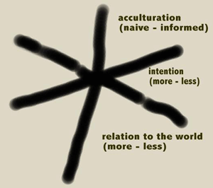
The "generators of abstraction" xyz chart above is by artblog godfather Dennis Hollingsworth.
If you haven't checked out his balance of insight, slapstick, schmoozing, and painting, click on this sentence. Dennis' quick graph is similar to the
Munsell color system in its awkward two dimensional representation.

I have been imagining Dennis' system as a construction of some kind. Similar to the Munsell tree.
 Imagine a tree where the tints and shades are replaced by slides of historical examples. Scott McCloud has been working on certain branches of this tree for over 15 years. I'm going to quote from McCloud's site now:
In Chapter Two of my 1993 book Understanding Comics, I devised a map of visual iconography (i.e., pictures, words, symbols) that took the shape of a triangle.

The lower left corner was visual resemblance (e.g., photography and realistic painting). 
The lower right included the products of what I called iconic abstraction (e.g., cartooning)
And at the top were the denizens of the picture plane ("pure" abstraction) which ceased to make reference to any visual phenomena other than themselves.
The move from realism to cartoons along the bottom edge was a move away from resemblance that still retained "meaning," so words, the next logical step in the progression, were included at far right, thereby enclosing anything in comics' visual vocabulary between the three points. 
I found that "The Big Triangle" as it came to be known, was an interesting tool for thinking about comics art...
...and for visual art and language in general! Eventually, I hope to include a Java-enabled interactive version of Triangle here on the site, but until then, feel free to "interact" with Understanding Comics to find out more.
(
You can check out Scott McCloud's site here).
I can't seem to answer Richard's question as to what the third variable would be on a political compass however. Fashion? Ego? Taste? Intention? I'm sure we will have software soon that will allow us to create our own compasses. Just plug in the variables and a globe is created.
 The "generators of abstraction" xyz chart above is by artblog godfather Dennis Hollingsworth. If you haven't checked out his balance of insight, slapstick, schmoozing, and painting, click on this sentence. Dennis' quick graph is similar to the Munsell color system in its awkward two dimensional representation.
 I have been imagining Dennis' system as a construction of some kind. Similar to the Munsell tree.
 Imagine a tree where the tints and shades are replaced by slides of historical examples. Scott McCloud has been working on certain branches of this tree for over 15 years. I'm going to quote from McCloud's site now:


4 comments:
Welcome! Splendid post.
I've come across the color tree before when I attended a lecture by Robert Gamblin, the founder of Gamblin oil paint. I don't know where he got the color from, but here's some info on his site.
http://www.gamblincolors.com/navigating.color.space/index.html
I think the triangular mapping is also interesting. However, I wonder if Scott McCloud is intending the triangle to read hierarchically as well - all symbolic reference is lower in the triangle than pure non-objective work.
I'm not sure if he intended that, but that's what I'm reading into it. (Maybe I'm defensive?) One could just as easily invert the triangle or place it on it's side, and it would be just as descriptive, but without the hierarchical connotation.....
Oh by the way, you can put a link to your site at the end of your post.
Please do, it helps people find you.
the third axis is the degree of how much you give a fuck about political orientation
rofl,
That's the best suggestion yet.
Post a Comment